From the dual-model architecture, through parameter decoupling, to the first systematic write-up of eight prompting rules and a dozen high-frequency workflows, the document makes one trend unmistakable:
AI image generation and editing have left the era of piling on mystical style words. They have entered spec-driven prompting.
This piece was first published on X, based on OpenAI’s official Image Prompting Guide. Below are the parts that actually matter, plus templates you can reuse.
#The shift underneath: two models, and keep parameters out of the prompt
Before writing a single prompt, get the mechanism straight. OpenAI is running a dual-model strategy this time, and it wants system parameters fully decoupled from the semantic prompt.
#Choosing between Flare and Sunburst
GPT Image 2.5 Flare (the fast small model)
- Role: lowest latency, high throughput
- Quality bar: comparable to GPT Image 2, but substantially faster
- Use when: realtime apps, sketch screening, cost-sensitive or high-concurrency flows
GPT Image 2.5 Sunburst (the quality base model)
- Role: maximum picture quality and fine-detail fidelity
- Quality bar: clearly above GPT Image 2, especially on complex structure and text rendering
- Use when: commercial hero visuals, print, dense diagrams, hard local edits
Official selection advice:
- If GPT Image 2 already meets quality for a stable workflow, try Flare first and check whether you can cut latency at the same quality.
- If current quality is not enough, establish a baseline with Sunburst first; only then test whether Flare can replace it. Do not guess latency and cost in the abstract, away from a real workload.
#Decouple API parameters from the prompt
OpenAI is explicit: if a parameter can control it, do not stuff it into the prompt.
| Parameter | Values | Official advice |
|---|---|---|
Model model | gpt-image-2.5-flare / gpt-image-2.5-sunburst | Trade quality against latency for the scene |
Quality quality | auto, low, medium, high, xhigh, max | Default auto. Use high for small type, dense infographics, and complex diagrams. Reserve xhigh / max for when latency and cost budgets allow |
Size size | auto or custom WIDTHxHEIGHT | Common sizes: 1024x1024 (square), 1536x1024 (landscape), 1024x1536 (portrait), 2048x1152 (2K landscape), 3840x2160 (4K) |
Background background | auto, opaque, transparent | Native alpha is the real update. For cut-out assets, set transparent and use PNG / WebP |
Note: outputs above 3,686,400 pixels (2560x1440) are still experimental.
#Eight official prompting rules
The docs boil high-quality generation and editing down to eight principles. Each one is aimed at the old “roll the gacha” habit.
#1. Define the result the way you would write a product spec
Name the subject and the delivery context (e-commerce white background, social ad, architecture diagram).
For anything complicated, structure the prompt in blocks:
- Scene
- Subject
- Details
- Constraints
#2. Use a prompt format your team can maintain
Phrases, narrative paragraphs, JSON-like structures, and nested instruction tags are all understood.
The point is readability, maintainability, and version history — not chasing a secret magic syntax.
#3. Replace mood words with visible specifics
Avoid: masterpiece, super realistic, 8k, epic lighting, amazing atmosphere.
Specify materials (weathered leather, brushed stainless steel), lighting (soft 45-degree afternoon side light, cool scattered daylight), color system, and capture medium (35mm film, 50mm viewpoint, slight vignette). Camera terms are treated as style cues, not as a physics simulation.
#4. Make pose and interaction concrete
Don’t stop at appearance. Lock three dimensions:
- Body framing: e.g. “full body visible, including both feet”
- Gaze: e.g. “looking down at the book in their hands”
- Real contact with the environment: e.g. “both hands naturally gripping the bicycle handlebars”
That is what keeps figures from going stiff or mannequin-like.
#5. Quoted text, plus an exact count
This is GPT Image 2.5’s headline capability:
- Wrap rendered copy in quotes and say how many times it should appear:
Render the tagline "Yours to Create" exactly once. - Specify placement and type (bold sans, centered, high contrast).
- Spell rare words or brand names letter by letter, and add negative constraints such as
No extra text, no watermarks.
#6. In edit mode, separate the change from the constraints
The core formula:
Change only [X]. Keep [A, B, C] strictly unchanged.
List protected attributes explicitly:
- Identity
- Facial structure
- Environmental lighting
- Camera position
- Background elements
#7. Give every reference image a job
When you pass multiple references, number them and assign roles:
For example: “Image 1 is the background and lighting baseline. Extract the dog from image 2 and place it next to the person in image 1, matching perspective and cast shadow.”
#8. Change one variable at a time
Feed the last good output into the next round. Adjust a single variable per step. If details start to drift, restate the protected constraints in the prompt.
#Worked examples: commercial generation recipes
The official guide shows a lot of cases you can drop into real work: brand design, diagrams, UI prototypes, pitch decks.
#Example 1: Film-like portrait and natural light
Point: describe age, real skin, film grain, and available light. Refuse the plastic face.
Parameters: size="1024x1536", quality="medium"
Create a photorealistic candid photograph of an elderly sailor standing on a small fishing boat.
He has weathered skin with visible wrinkles, pores, and sun texture, and a few faded traditional sailor tattoos on his arms.
He is calmly adjusting a net while his dog sits nearby on the deck. Shot like a 35mm film photograph, medium close-up at eye level, using a 50mm lens.
Soft coastal daylight, shallow depth of field, subtle film grain, natural color balance.
The image should feel honest and unposed, with real skin texture, worn materials, and everyday detail. No glamorization, no heavy retouching.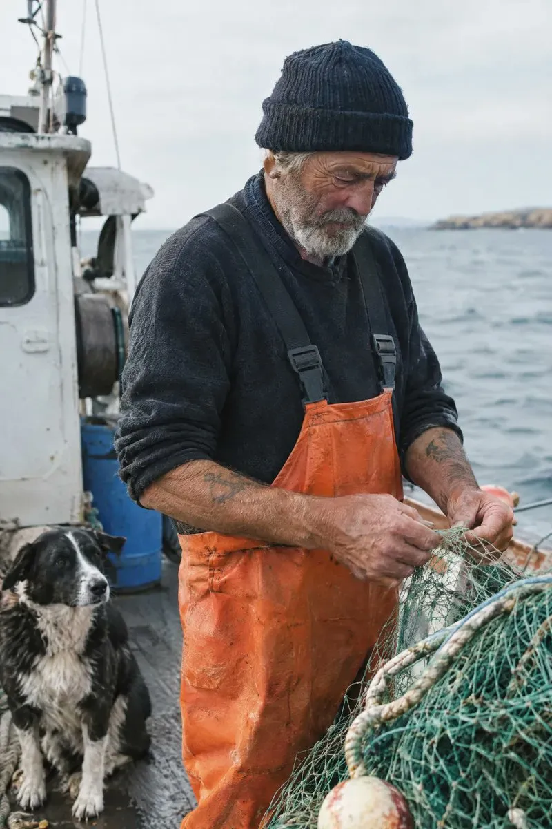
Why it works: unposed, visible wrinkles, pores, and No heavy retouching are what suppress the airbrushed plastic look.
#Example 2: Ad-grade text, exactly once
Point: brand tone, copy frequency, layout integration, and negative filters.
Parameters: size="1024x1536", quality="medium"
Give me a cool in culture ad / fashion shot for a brand called Thread.
It's a hip young street brand. The ad shows a group of friends hanging out together with the tagline "Yours to Create."
Make it feel like a polished campaign image for a youth streetwear audience: stylish, contemporary, energetic, and tasteful.
Use clean composition, strong color direction, natural poses, and premium fashion photography cues.
Render the tagline exactly once, clearly and legibly, integrated into the ad layout.
No extra text, no watermarks, no unrelated logos.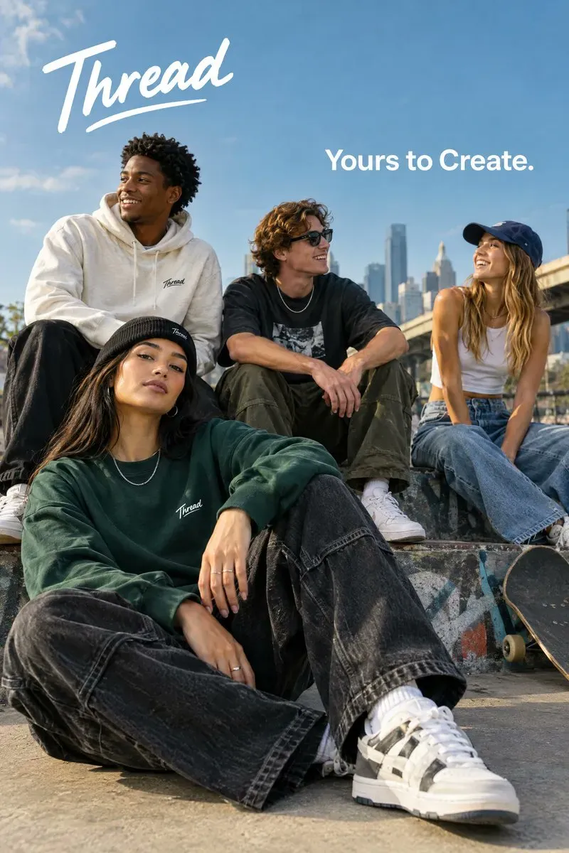
Why it works: Render the tagline exactly once is the sentence that stops the model from stamping the line all over the frame.
#Example 3: Vector logo on a native transparent background
Point: native alpha, padding, and legibility at every size.
Parameters: size="1024x1536", quality="medium", background="transparent", output_format="png"
Create an original, non-infringing logo for a company called Field & Flour, a local bakery.
The logo should feel warm, simple, and timeless. Use clean, vector-like shapes, a strong silhouette, and balanced negative space.
Favor simplicity over detail so it reads clearly at small and large sizes. Flat design, minimal strokes, no gradients unless essential.
Fully transparent background. Deliver a single centered logo with generous padding, clean alpha edges, and no solid backdrop, scenery, checkerboard, or watermark.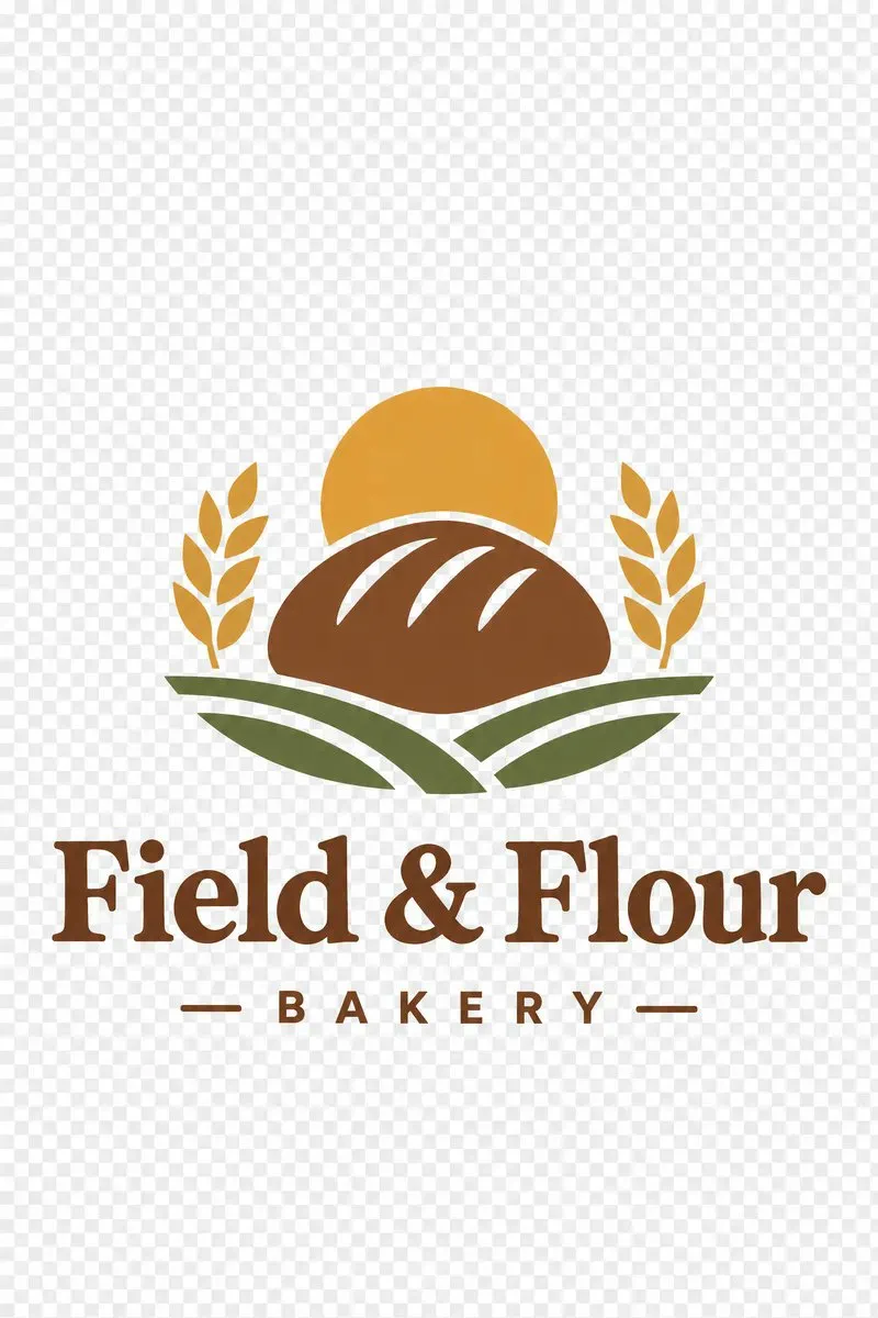
Why it works: set background="transparent" and say “no solid backdrop, no checkerboard, clean alpha edges” in the prompt.
#Example 4: A four-panel comic beat sheet
Point: define visual beats panel by panel so the story has rhythm.
Parameters: size="1024x1536", quality="medium"
Create a short vertical comic-style reel with 4 panels.
Panel 1: The owner leaves through the front door. The pet is framed in the window behind them, small against the glass, eyes wide, paws pressed high, the house suddenly quiet.
Panel 2: The door clicks shut. Silence breaks. The pet slowly turns toward the empty house, posture shifting, eyes sharp with possibility.
Panel 3: The house transformed. The pet sprawls across the couch like it owns the place, crumbs nearby, sunlight cutting across the room like a spotlight.
Panel 4: The door opens. The pet is seated perfectly by the entrance, alert and composed, as if nothing happened.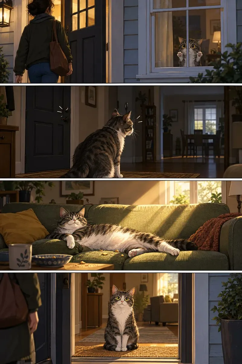
Why it works: each panel from 1 to 4 carries both an action and a beat of conflict. Easy to reuse for short comics and storyboard scripts.
#Example 5: A real phone UI, in a real device frame
Point: treat the model as a finished-product UI designer. Name the modules. Avoid concept-art chrome.
Parameters: size="1024x1536", quality="medium"
Create a realistic mobile app UI mockup for a local farmers market.
Show today's market with a simple header, a short list of vendors with small photos and categories, a small "Today's specials" section, and basic information for location and hours.
Design it to be practical, and easy to use. White background, subtle natural accent colors, clear typography, and minimal decoration.
It should look like a real, well-designed, beautiful app for a small local market.
Place the UI mockup in an iPhone frame.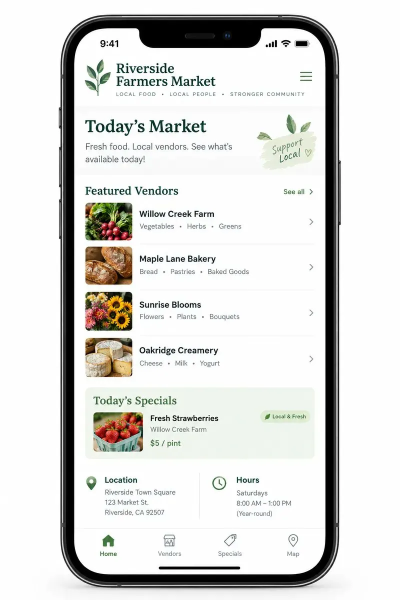
Why it works: skip concept art and futuristic UI. Ask for practical, easy to use, in an iPhone frame, and you get a hi-fi demo you can show a client.
#Example 6: A classroom science diagram
Point: name the audience, the terms, and the arrows.
Parameters: size="1536x1024", quality="high"
Create a simple biology diagram titled "Cellular Respiration at a Glance" for high school students.
Show how glucose turns into energy inside a cell. Include glycolysis, the Krebs cycle, and the electron transport chain.
Use arrows to connect the steps, and label the main molecules: glucose, pyruvate, ATP, NADH, FADH2, CO2, O2, and H2O.
Make it look like a clean classroom handout or slide, with a white background, simple icons, clear labels, and easy-to-read text.
Avoid tiny text, extra decoration, or anything that makes the diagram hard to understand.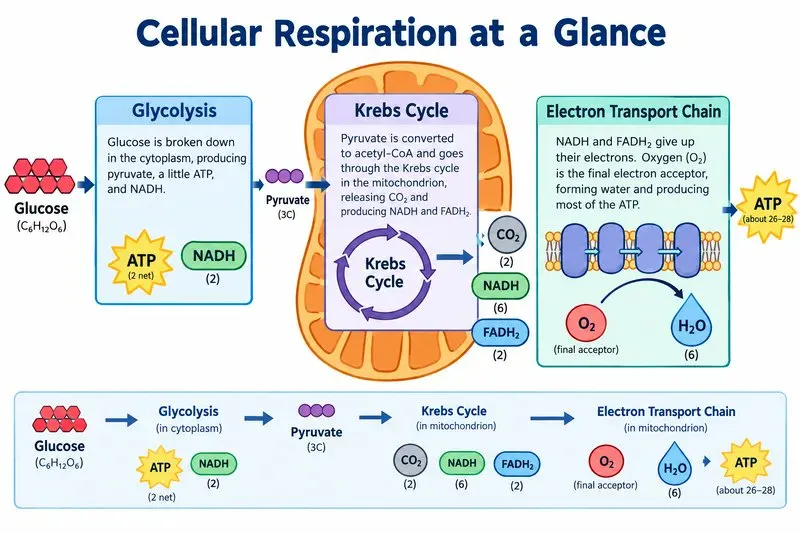
Why it works: with stacked jargon and flow, turn quality="high" on. It cuts garbled labels and confused arrows.
#Example 7: A YC-style fundraising slide
Point: spec-sheet prompting with concrete numbers. Ban generic illustration.
Parameters: size="1536x864", quality="high"
Create one pitch-deck slide titled "Market Opportunity" that feels like a real Series A fundraising slide from a YC-backed startup.
Use a clean white background, modern sans-serif typography like Inter, and a crisp, minimal layout. The slide should include:
* A TAM/SAM/SOM concentric-circle diagram in muted blues and grays
* Specific, believable market sizing numbers:
  * TAM: $42B
  * SAM: $8.7B
  * SOM: $340M
* A clean bar chart below showing market growth from 2021 to 2026, with a subtle upward trend
* Small footnotes: "AGI Research, 2024" and "Internal analysis"
* A company logo placeholder in the bottom-right corner
The design should look like it belongs in a deck that actually raised money: highly readable text, clear data hierarchy, polished spacing, and professional startup-style visual language.
Avoid clip art, stock photography, gradients, shadows, decorative elements, or anything that feels generic or overdesigned.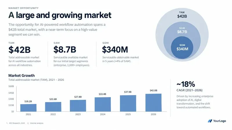
Why it works: feed real numbers and footnotes, and ban clip art, stock photography, shadows. The slide looks like it belongs in a deck that raised money.
#Advanced: edits and cross-image consistency
The biggest jump from the previous generation is multi-image reference, surgical local edits, and subject consistency.
#1. Virtual wardrobe, same face
Change clothes from a reference garment image without touching likeness, proportions, or pose.
The key sentence: Do not change her face, facial features... Preserve her exact likeness... Replace only the clothing...
Edit the image to dress the woman using the provided clothing images.
Do not change her face, facial features, skin tone, body shape, pose, or identity in any way.
Preserve her exact likeness, expression, hairstyle, and proportions.
Replace only the clothing, fitting the garments naturally to her existing pose and body geometry with realistic fabric behavior.
Match lighting, shadows, and color temperature to the original photo so the outfit integrates photorealistically, without looking pasted on.
Do not change the background, camera angle, framing, or image quality, and do not add accessories, text, logos, or watermarks.#2. Precise multi-image composite
Put the subject from image 2 into the scene of image 1:
Place the dog from the second image into the setting of image 1, right next to the woman,
use the same style of lighting, composition and background. Do not change anything else.#3. One-shot product cut-out
Skip the old masking tools. Ask for commercial alpha directly:
Extract the product from the input image and isolate it on a fully transparent background.
Output: centered product, crisp silhouette, no halos/fringing.
Preserve product geometry and label legibility exactly.
Add only light polishing. Do not add a solid backdrop, checkerboard, scenery, or shadow.
Do not restyle the product; remove the background and preserve clean alpha transparency.#4. Sketch to photoreal
Keep the original perspective, proportions, and layout. Assign real materials:
Turn this drawing into a photorealistic image.
Preserve the exact layout, proportions, and perspective.
Choose realistic materials and lighting consistent with the sketch intent.
Do not add new elements or text.#5. Surgical object swap
Replace one piece of furniture. Leave floor shadows, reflections, and light direction alone:
In this room photo, replace ONLY the white chairs with chairs made of wood.
Preserve camera angle, room lighting, floor shadows, and surrounding objects.
Keep all other aspects of the image unchanged.
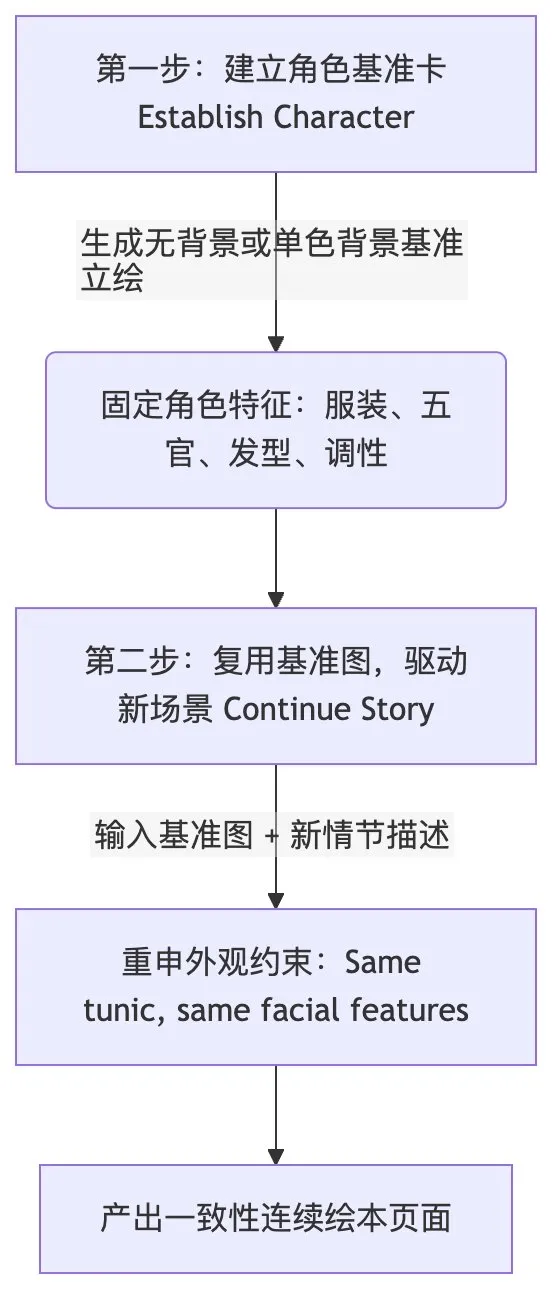
Photorealistic contact shadows and fabric texture.#6. Character consistency across a picture book
For multi-page stories, the official recipe is two stages.
Stage 1: build a character card
Create a children's book illustration introducing a main character.
Character: A young, storybook-style hero wearing a simple green hooded tunic, soft brown boots, and a small belt pouch. Kind expression, gentle eyes.
Style: Children's book illustration, hand-painted watercolor look, warm earthy colors.
Constraints: Original character, no text, plain forest background.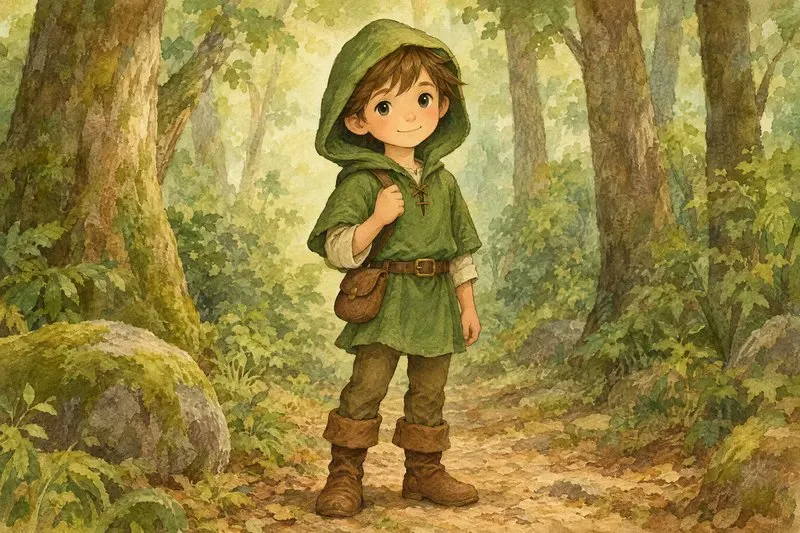
Stage 2: continue the story
Continue the children's book story using the same character.
Scene: The same young forest hero is gently helping a frightened squirrel out of a fallen tree after a winter storm.
Character Consistency:
- Same green hooded tunic
- Same facial features, proportions, and color palette
- Same gentle, heroic personality
Constraints: Do not redesign the character, no text.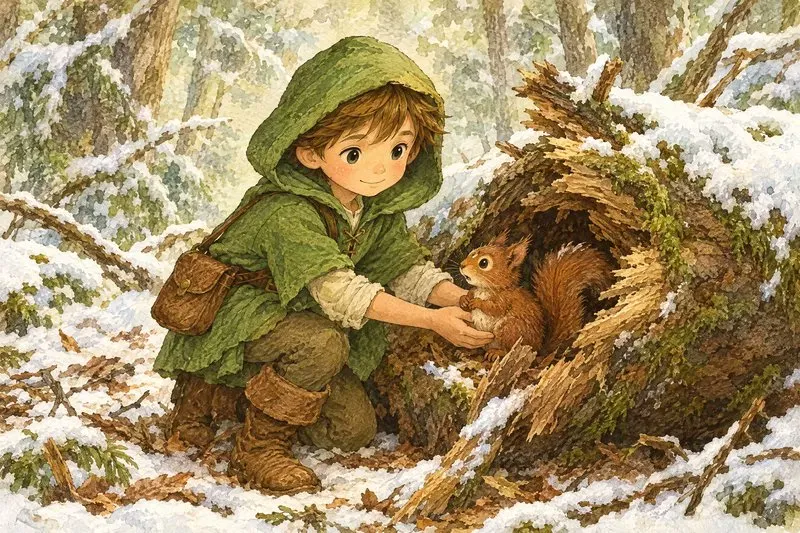
#Shipping it: a six-step eval and migration path
If you are putting GPT Image 2.5 into a production workflow or an automation pipeline, this is the engineering sequence OpenAI recommends:
-
Save a baseline set
Collect the most representative production prompts and reference images (hard edits, precise text, faces, geometrically symmetric products, transparent edges). Keep the old model’s outputs as the control. -
Pick the first candidate
If GPT Image 2 already passes, start withgpt-image-2.5-flarefor speed. If quality is the pain, start withgpt-image-2.5-sunburstfor the ceiling. -
Score the full set of dimensions
Instruction following, subject and product fidelity, spelling accuracy, unexpected deformation, and alpha quality. Run multiple requests to judge consistency. -
Step down once it passes
If Sunburst is good enough, try Flare on the same prompts. If quality stays acceptable, switch for latency and cost. -
Change one parameter at a time
Before rewriting the prompt, testquality(for examplemediumtohigh) and watch what happens to the critical details. -
Roll out by workflow, not all at once
After it passes, shift a small slice of traffic. Watch P95 latency, retry rate, and cost per accepted image.
#From playing with pictures to delivering them
The largest lesson in the official guide is this:
Image generation has left the early “draw and hope” stage. It is becoming an engineering discipline — deterministic, predictable, maintainable.
The skill that matters is not a dictionary of pretty adjectives. It is:
- Structured thinking: scene, subject, interaction, and constraints, said in sections
- Hard boundaries: in edits, name what changes and what must not
- Parameters and prompts doing different jobs: let the API own resolution, quality, and alpha; let the prompt own visual meaning
Keep the guide. Next time you open the API, write the next prompt as a spec.